
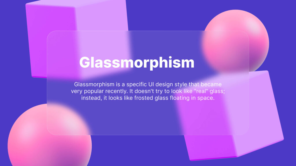
Creating a modern UI in Figma, a glassmorphism is one of the best effect to add a modern look to your UI design. Creating a glassmorphism effect in Figma is very easy.
Quick Note: A glass effect and a glassmorphism effect are different effects. The glass effect is a simple way of making an object look like a piece of clear glass. But the glassmorphism is used to look like frosted glass floating in space. Here is the quick comparison.
Quick Comparison Table
| Feature | Glass Effect | Glassmorphism |
| Look | Clear and realistic | Frosted and blurry |
| Blur | Usually none | Heavy background blur |
| Main Goal | To look like real glass | To create depth and layers |
| Borders | Not always needed | Thin, soft white borders |
| Best For | Icons and 3D art | Website and App UI |
Step 1
- Open your design and remember this glassmorphism effect is perfectly visible when you add some elements behind; otherwise, it becomes a normal blurry rectangle.
- First, add your assets so the effect will look clear.
- After you arrange all assets, now add a normal rectangle to your design and smooth the corners around “60 to 65%” (that’s based on your website UI design).
- Now select the rectangle and go to the Fill option and reduce the opacity to “10%.”
- The rectangle color stays the default “#D9D9D9”; that’s the perfect color for that effect(also, that’s based on your website UI design).
- Now go to the effects, select “Background Blur”, and set the blur to “35”.
- Here, 50% of the work is complete, but the next 50% gives this rectangle the real glassmorping personality.

Step 2
- Now we need to create two light strokes to add the edge and differentiate from the background.
- Select the rectangle and add a “stock” and select the gradient.
- Now apply the color that matches your background. ( mostly white color )
- Now adjust your stock points to mimic the direction of light and reduce the opacity to “50%.”
- Now the glassmorphine can be visible on the background, but to add the edge, we need another light stroke to fill the other side of the border area.
- So, simply duplicate the stock line and invert the gradient endpoint, and set the opacity to “10%.”
- Note: That part is slightly confusing, so I recommend watching my YouTube tutorial below for the best understanding.
- After your stock line is perfectly aligned, the rectangle becomes the perfect glassmorphism effect.
- Now your glassmorphism effect is done.

Pro Tip
- Keep in mind, the true glassmorphism effect shines when an object is behind it. Without any object behind it, it becomes the normal blurry rectangle.
- Experiment more with stroke lines for a better look on you Ui design.
Conclusion
A glassmorphism effect can elevate your UI design to a modern level. That effect is simple to do in Figma. You can use that effect on any type of UI design. What are your thoughts about that topic? Let me know in the comments. If you still have any confusion, watch this YouTube tutorial below.
Have a nice day.
Topic: Figma, Glassmorphism.

Hi, I’m Ashish Zapadiya! I’m the founder of filcen.com, a passionate content creator diving deep into Editing and Tech. With my awesome team, I’m on a mission to build a leading company, always focused on delivering top-notch content.
